Excel, Gantt Charts
Apr 27, 2026
How to Create a Gantt Chart in Excel
Key Takeaways
- Excel doesn't have a native Gantt chart type, but you can build one by formatting a 2-D stacked bar chart with your project data.
- You'll need four columns of data: task name, start date, days completed and days remaining.
- The formatting involves hiding the start-date bar, adjusting the date axis and reversing task order so the first task appears on top.
- You can add task dependencies using simple formulas to create gaps or overlaps between tasks.
What Is a Gantt Chart in Excel?
A Gantt chart is a horizontal bar chart that plots project tasks against a timeline. Each bar represents a single task, showing when it starts, how long it takes and how much progress has been made. It's one of the most widely used tools in project management for tracking everything from construction schedules to product launches and event planning.
If you build a house, for example, a Gantt chart can illustrate the time it takes to procure the site, get permits, buy materials, hire workers, connect utilities and so on. Tasks also have relationships: you can't start work without permits or have workers show up before materials arrive. A Gantt chart will also tell you how much of each task is complete and how much left there is to do.
Excel doesn't include a built-in Gantt chart type, but you can create one by reformatting a stacked bar chart. The process takes a few formatting steps, but the result is a clean, professional chart you can customize however you need. This guide walks through building one from scratch. If you'd rather start with a pre-built file, jump to the Free Excel Gantt Chart Templates section below.
The table below shows the four data columns your chart will use:
| Column | Description |
|---|---|
| Task Name | The name or label for each project task |
| Start Date | The date the task is scheduled to begin |
| Days Completed | The number of days of work already finished |
| Days Remaining | The number of days of work still left to do |
What You Need Before You Start
Before you dive into the steps, make sure you have the following ready:
- Microsoft Excel 2013 or later (including Microsoft 365). The steps in this guide use the Ribbon interface available in all modern versions.
- Your project data organized into four columns: task name, start date, days completed and days remaining.
- Optionally, download the Gantt Chart Template 1_gantt data starter file so you can follow along with the exact data used in this tutorial.
How to Create a Gantt Chart in Excel
Step 1: Enter Your Project Data
We'll start by entering a task name, the date the task will start, how many days of each task have been completed and how many days are still left to go. We also need to know the start and end dates, but putting those on the worksheet is optional.
Input the data as follows:

You can save some time by downloading Gantt Chart Template 1_gantt data.
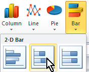
Step 2: Insert a 2-D Stacked Bar Chart
Now click anywhere inside the data area, go to the Insert tab on the Ribbon bar, and in the Charts section, click Bar (or Bar Chart in newer Excel versions) and choose the 2-D Stacked Bar option (the second item in the 2-D group).
Step 3: Apply a Chart Style
This puts a chart on the worksheet that needs some tweaking. Stretch the chart out to see it better, then apply a built-in design. Keep the chart selected, go to the Design tab on the Ribbon bar (under the Chart Tools section that appears when the chart is selected), and in the Chart Styles section, click the down arrow to reveal all the available styles.![]()
I chose Style 45. (Note: chart style numbers may vary by Excel version. Choose a style with a dark or transparent background that makes the bars easy to read.)

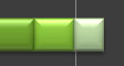
Most of the bars show three sections: the length of time before the project starts, the days completed, and the days remaining.
Step 4: Hide the Start Date Bars
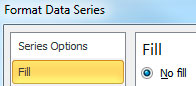
We need to hide the first section of each bar, because the length of time before the project starts is meaningless data. So right-click any of the first sections and select Format Data Series from the popup menu.
In the Format Data Series pane that appears (in Excel 2013+ and Microsoft 365, this opens as a pane on the right side of the screen rather than a dialog box), click in the Fill section and select No fill.
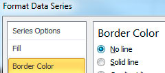
Click the Border Color section on the left, and choose No line.
Click the Shadow section on the left, and choose No shadow under the Presets dropdown.
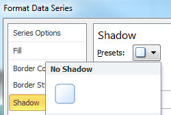
Click the Close button in the lower, right corner of the dialog, and click the chart background to get a better look.
Step 5: Adjust the Date Range on the Horizontal Axis
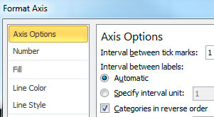
Now let's fix the range of dates along the bottom. Right-click any of the dates. The tooltip should tell you it's the Horizontal Axis.
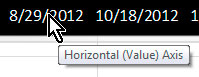
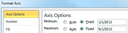
Select Format Axis from the popup menu. We want to set the start date as January 1, 2013 and the end date as September 1, 2013. In the Axis Options section on the left, change the Minimum and Maximum settings to Fixed, and enter the dates.
Click the Close button in the lower, right corner of the dialog.
Step 6: Reverse the Task Order
Now let's reverse the list of tasks in the vertical axis so that Task 1 is on top. Right-click one of the task names and select Format Axis from the popup menu. The tooltip should tell you it's the Vertical Axis.
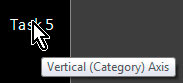
From the Axis Options section on the left, select the box for Categories in reverse order.
Click the Close button in the lower, right corner of the dialog.
Step 7: Move the Date Axis Back to the Bottom
But look what that does! It puts the horizontal axis on top of the chart. If you want it back on the bottom, there's a quick fix: once again, right-click one of the dates on the horizontal axis, and from the Axis Options section on the left, click the dropdown list for Axis labels and select High.
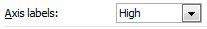
Click the Close button in the lower, right corner of the dialog.
Step 8: Clean Up the Legend
The last thing we want to do to the chart is fix the legend. The Start Date no longer appears in the chart, since it was extra information that we deleted in the first steps. Click the legend to select it, then click Start Date to sub-select it.
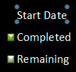
Press the Delete key on your keyboard to delete it.
Now right-click the legend and select Format Legend from the popup menu. In the Legend Options section of the dialog, select Bottom.
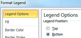
Click the Close button in the lower, right corner of the dialog.
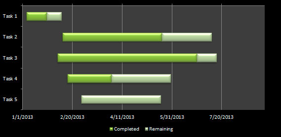
Your Completed Excel Gantt Chart
Congratulations! You now have a completed Gantt chart.
Bonus: Add Task Dependencies with Formulas
But one more thing: what if you need to create a relationship between the end of Task 1 and the beginning of Task 2? Maybe there should be a 2-day gap between them or a 5-day overlap. For that, we'll put a formula in the data.
Select B5 and delete. To create a 2-day gap from the end of Task 1, enter the formula:
=B4+C4+D4+2
If you want a 5-day overlap, enter this formula, instead:
=B4+C4+D4-5
Now put it to work: for Task 1, change the start date (B4), or the days completed (C4) or the days remaining (D4). As soon as you do, the bar for Task 2 will adjust automatically with respect to the bar for Task 1.
To play with the completed exercise, or to use it for your own projects, download Gantt Chart Template 1_gantt complete.
Free Excel Gantt Chart Templates
If you'd rather skip building a Gantt chart from scratch, templates can save you significant time. Here are a few places to find them:
- This tutorial's downloadable files. The starter data file and completed chart file linked above give you a ready-made starting point you can adapt to your own projects.
- Excel's built-in template gallery. Go to File > New and search for "Gantt chart." Microsoft offers several free templates with pre-formatted stacked bar charts and color-coded progress tracking.
- Microsoft's online template library. Visit the Microsoft 365 template site to browse additional Gantt chart options you can download directly into Excel.
A good Gantt chart template typically includes a task list column, date columns for start and end dates, a pre-formatted stacked bar chart and color coding that distinguishes completed work from remaining work.
Benefits of Using a Gantt Chart in Excel
Excel is a solid choice for building Gantt charts, especially for small-to-medium projects. Here's why:
- No additional software cost. If you already have Excel, you don't need to buy or subscribe to a dedicated project management tool.
- Familiar interface. Most professionals already know how to navigate Excel, which means less time learning new software and more time managing the project.
- Powerful customization. You can use conditional formatting, formulas, dropdown lists and custom chart styles to tailor the chart to your exact needs.
- Easy sharing. You can email Excel files, store them in shared drives or upload them to cloud platforms like OneDrive and SharePoint.
- Compatible with existing data. If your project data already lives in a spreadsheet, you can build the chart right where the data is without importing or converting files.
Limitations of Excel Gantt Charts
Excel Gantt charts work well for straightforward projects, but they do have boundaries worth knowing about:
- No native Gantt chart type. You have to manually format a stacked bar chart, which takes time and can be confusing the first time through.
- No automatic dependency tracking. Task relationships require manual formulas (like the gap and overlap formulas we showed above) rather than built-in logic that updates on its own.
- Difficult to scale. Projects with dozens or hundreds of tasks become hard to manage in a single Excel chart. Scrolling, readability and performance all suffer as complexity grows.
- Limited real-time collaboration. While Microsoft 365 supports co-authoring, Excel still lacks the real-time commenting, notifications and assignment features found in dedicated project management platforms.
For complex, multi-team projects, a dedicated tool may be the better fit. But for most day-to-day project tracking, Excel gives you everything you need once you know how to use it well.
Build Your Excel Skills with Pryor Learning
Now that you know how to create a Gantt chart, imagine what you could do with advanced Excel skills like dynamic charts, conditional formatting and automated dashboards. Pryor Learning offers live and On-Demand Excel training courses designed for every skill level, from spreadsheet basics to power-user techniques. Explore our full catalog of Excel training courses to take your next step.