Basic Excel, Excel
Apr 30, 2026
How to Make a Pivot Table in Excel: A Step-by-Step Guide
Excel is a powerful reporting tool, providing options for both basic and advanced users. One of the easiest ways to create a report in Excel is by using the PivotTable feature, which allows you to sort, group and summarize your data simply by dragging and dropping fields. This pivot table Excel tutorial walks you through how to create a pivot table from scratch so you can turn raw data into meaningful reports in minutes.
Key Takeaways
- A pivot table lets you summarize, sort and analyze large datasets in Excel without writing formulas.
- Organize your source data with one record per row, unique column headers and no blank rows before creating a pivot table.
- Build a pivot table step-by-step by inserting it from the Insert ribbon and dragging fields into the Rows, Columns and Values areas.
- Enhance your report with formatting, slicers, filters and pivot charts for interactive data analysis.
What Is a Pivot Table (and Why Use One)?
A pivot table is a built-in Excel feature that lets you reorganize and summarize selected columns and rows of data to create a customized report. Instead of writing complex formulas or manually sorting through hundreds of rows, you drag and drop fields to instantly see totals, averages, counts and other calculations.
Pivot tables are useful across virtually every business function. Common use cases include:
- Sales summaries by territory, product or time period
- Budget tracking and expense breakdowns
- HR headcount analysis by department or location
- Inventory reports showing stock levels and turnover
The table below shows why pivot tables are often a better choice than building reports with manual formulas:
| Feature | Pivot Table | Manual Formulas |
|---|---|---|
| Setup time | Minutes | Can take hours |
| Updates automatically | Yes, with a single refresh | Formulas must be rewritten or copied |
| No formulas needed | Yes | Requires SUMIF, COUNTIF, VLOOKUP, etc. |
| Interactive filtering | Built-in slicers and filters | Requires manual re-sorting |
No matter the size of your dataset, a pivot table report gives you a fast, flexible way to analyze information and present it clearly.
First, Organize Your Data
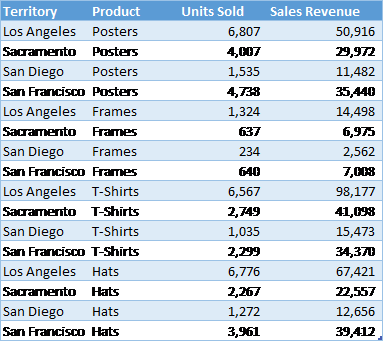
Record your data in rows and columns. For example, data for a report on sales by territory and product might look like this:
A PivotTable report works best when the source data have:
- One record in each row.
- One column for each category for sorting and grouping (such as "Territory" and "Product" in the example above); and
- One column for each metric (such as "Units Sold" and "Sales Revenue" above). Recording some sales revenue in a different column complicates the task of adding up all of the sales revenue.
Beyond these three rules, follow these additional best practices to ensure your pivot table works correctly:
- Use unique column headers with no duplicate names. These become your pivot table fields.
- Remove blank rows and blank columns within your data range.
- Keep data types consistent within each column (don't mix text and numbers in the same field).
- Consider converting your range to an Excel Table (Ctrl+T) so the pivot table automatically includes new rows when you refresh.
Well-structured data is the foundation of an accurate pivot table. A few minutes spent cleaning your source data will save you troubleshooting time later.
Create the PivotTable
Next, create the PivotTable report:
- Select any cell within your data range (Excel will auto-detect the full range).
- From the Insert ribbon, click the PivotTable button.
- In the PivotTable Fields pane on the right, check the fields you want as row labels and drag them to the Rows area.
- Check the fields you want as column headers and drag them to the Columns area.
- Drag numeric fields you want to summarize into the Values area.
- For each item under Values, specify how to aggregate the data—with a sum, average, or some other function. This is a great time-saving step!

With each change, you'll see your PivotTable report take shape. If you decide you don't like the layout, just drag the fields to other positions.
Formatting Your PivotTable Report
From the PivotTable Design ribbon, choose a style for your report based on your theme's color schemes with options for header rows, header columns, totals and subtotals.
From the Home ribbon, set the number format for your data. Alternatively, right-click your data, choose Value Field Settings and click Number Format to apply formatting directly to a specific field.
How to Add Slicers and Filters to Your Pivot Table
Slicers are visual filter buttons you can add to a pivot table for interactive reporting. Instead of digging through menus, you and your audience can click a button to instantly filter the data on screen.
To insert a pivot table slicer:
- Click anywhere inside your pivot table.
- Go to PivotTable Analyze > Insert Slicer.
- Select the field or fields you want to filter by (for example, Territory or Product).
- Click OK.
A slicer panel appears on your worksheet. Click any value in the slicer to pivot table filter your report instantly. To filter by date, use the Timeline option in the same Analyze ribbon. Timelines work just like slicers but are designed specifically for date fields.
Slicers and filters make your pivot table reports interactive and presentation-ready, which is especially useful when sharing dashboards with colleagues or leadership.
How to Create a Pivot Chart from Your Pivot Table
A pivot chart is a visual representation of your pivot table data. It updates automatically whenever the underlying pivot table changes, keeping your charts and data in sync.
To create a pivot chart:
- Click anywhere inside your pivot table.
- Go to PivotTable Analyze > PivotChart.
- Choose a chart type (bar, column, line, pie, etc.).
- Click OK.
Your chart appears on the worksheet and reflects the same filters and layout as your pivot table. This is especially useful for dashboards and presentations where stakeholders need a quick visual summary rather than rows of numbers.
Other Report Options
Do you want even more flexibility in your reports? Do you ever need to, say, connect to data in an external database or create charts based on your reports? All of these options are available with PivotTables!
Or, if you need more flexibility than PivotTables provide, you can:
- Create a freeform report by adding totals and subtotals directly to your source data,
- Use the Group and Subtotal options on the Outline section of the Data ribbon, or
- Use the Quick Analysis button (Ctrl+Q) to instantly apply charts, formatting or totals to selected data.
No matter which option you choose, Excel is one of the most flexible reporting tools available today!
Build Your Excel Skills with Pryor Learning
Creating a pivot table is just the beginning of what you can accomplish in Excel. Pryor Learning offers live virtual and In-Person Excel seminars as well as On-Demand courses covering pivot tables, formulas, dashboards and more. Hands-on, instructor-led training is one of the fastest ways to build confidence and move from beginner to power user. Explore Pryor's Excel training options to take your skills to the next level.


